Farmers wanted to buy — the platform was in their way
Kisan4U is an agricultural e-commerce platform connecting Indian farmers directly with suppliers and bulk buyers. The platform existed, but wasn't being used — farmers would visit, get lost or confused, and leave before completing a transaction. Conversion was critically low despite significant demand for what the platform offered.
The brief: redesign the platform for a user group that is often accessing the internet for the first time, may have limited literacy, uses mobile-only in low-bandwidth environments, and has deep distrust of anything that feels unfamiliar or risky. Every extra step, every unexplained form field, was a reason to abandon.
Owning the redesign end-to-end, at startup pace
What I Owned
Sole UX/UI Designer at a fast-paced startup. I owned the redesign from research through final Figma prototypes, conducting stakeholder interviews, running usability sessions, defining the information architecture, and designing all key screens single-handedly. Timelines were compressed; I had to make confident decisions with incomplete data and validate them quickly.
The Constraint
Designing for users I couldn't easily observe directly. Most of the user base was rural, mobile-only, and unavailable for traditional lab testing. I had to triangulate insights from stakeholder knowledge, field agent reports, and proxy usability sessions with low-digital-literacy participants sourced locally.
Farmers didn't distrust the internet — they distrusted complexity
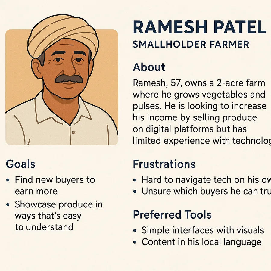
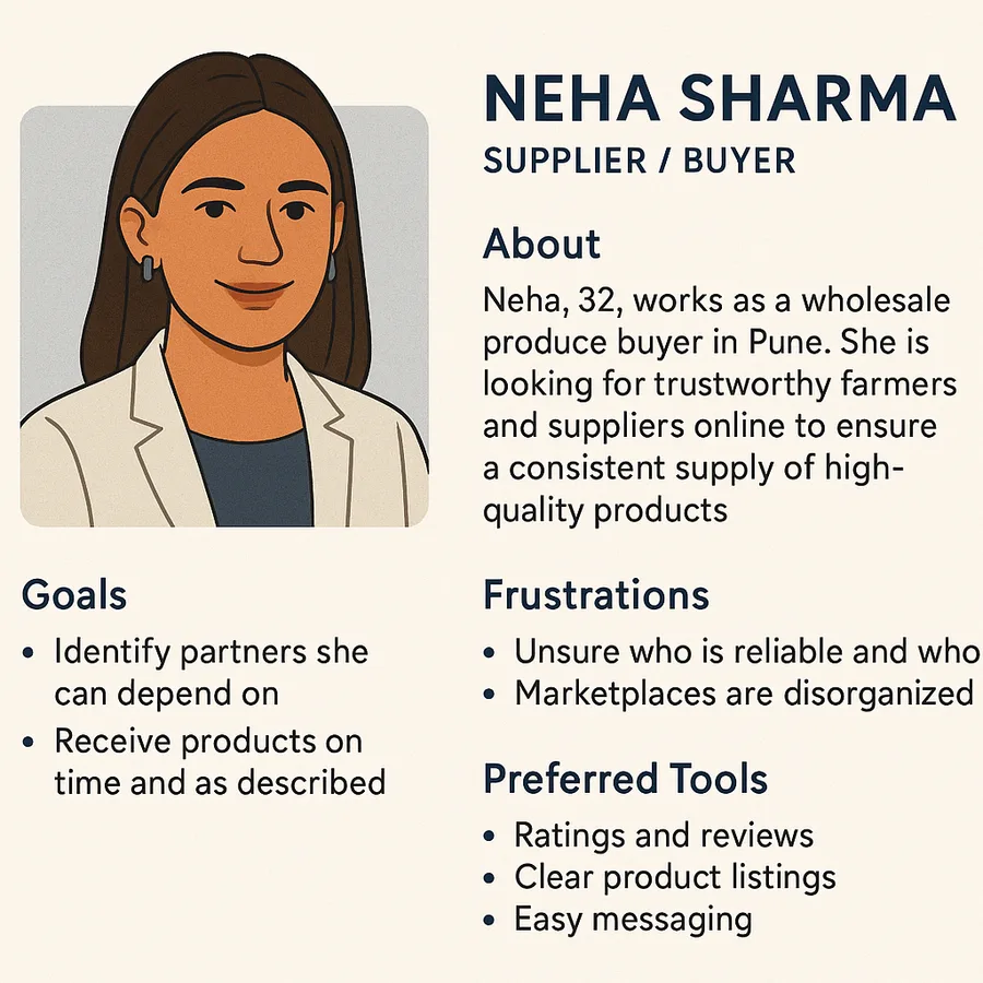
I ran a heuristic audit of the existing platform, mapped the end-to-end user journey against observed drop-off patterns, and conducted usability sessions with participants matched to the target demographic — focusing on first-time internet users and users with limited reading fluency.
The Central Insight
Farmers didn't distrust the internet — they distrusted complexity. The existing platform assumed digital fluency that most users didn't have. Every extra step, every unexplained form field, every jargon-heavy label was experienced as a signal that something might go wrong. Trust had to be built through simplicity, not through reassurance copy that users couldn't read or believe.
Key patterns from research sessions:
- Users relied almost entirely on visual cues — icons, product images, and colour coding — while ignoring or misreading text-heavy labels
- Trust signals (verified badges, ratings, return policies) were the primary decision trigger — users wanted proof before they'd commit to any action
- Navigation depth was a hard ceiling: users could not reliably find products more than 2 taps from the homepage
- The existing 7-step checkout had three fields users didn't understand and couldn't complete without help
- Mobile experience was inconsistent across screen sizes, creating layout breaks that users interpreted as the site "being broken"
Three rounds to a navigation and checkout that work without reading
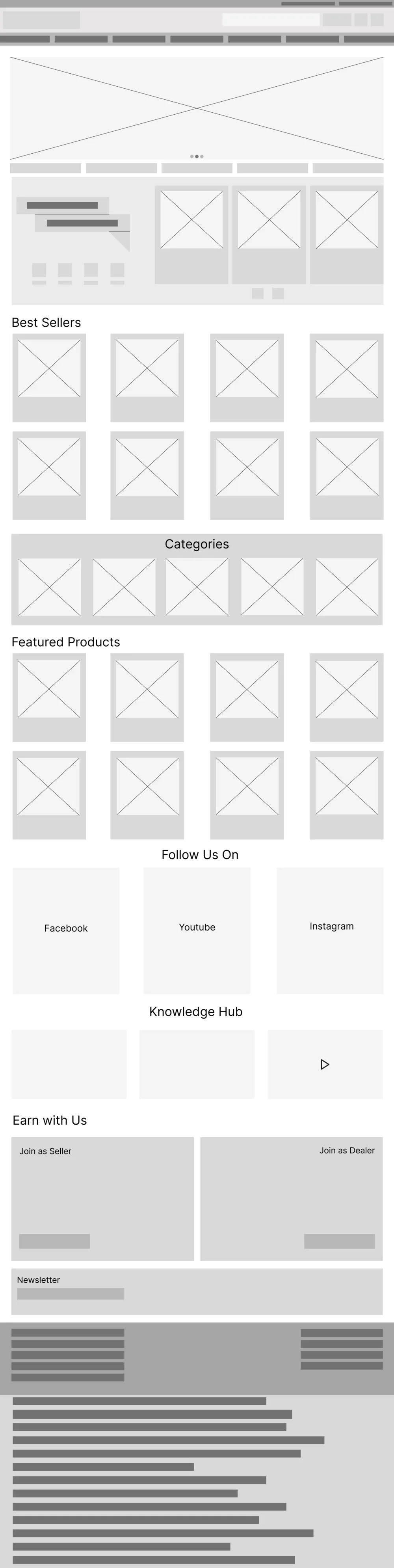
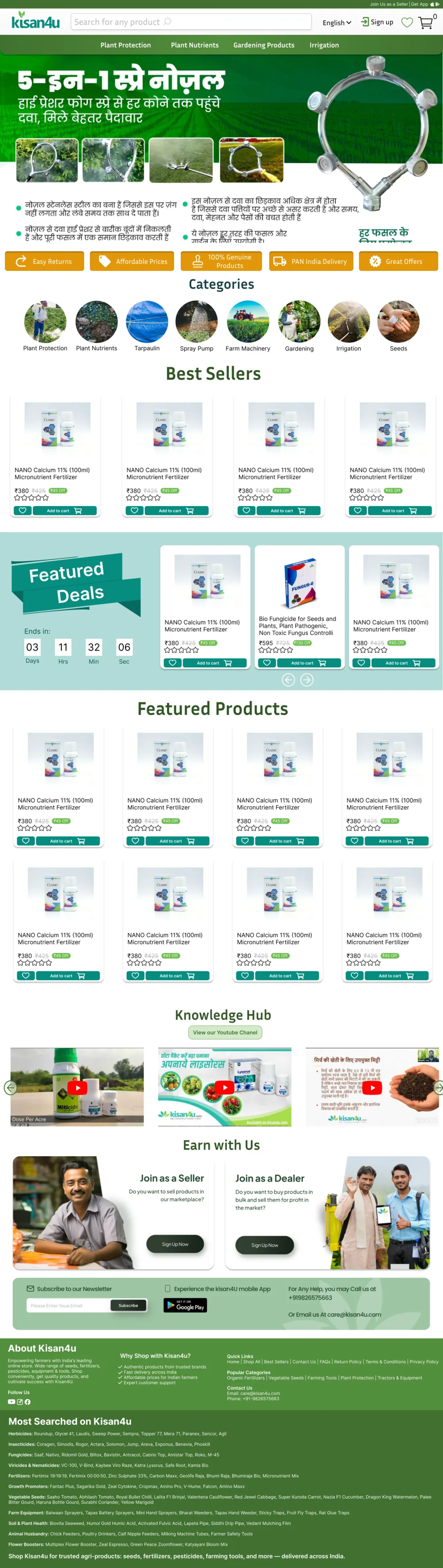
I explored multiple approaches for the two highest-impact areas — navigation and checkout — before settling on the final system.
Category text list. Familiar pattern from desktop e-commerce but failed on mobile — users tapped the wrong items and couldn't distinguish categories from product names at small sizes.
Icon grid only. Reduced reading load but introduced ambiguity — icons for "seeds," "fertiliser," and "tools" looked similar enough to cause confusion without labels.
Icon + short label cards. Bold icon paired with a 1–2 word label on a tappable card. Highest recognition rate in testing; users could identify categories on first attempt without assistance.
7-step linear form. Existing flow. Users abandoned at step 3 (payment details) in every session — fields were unfamiliar and there was no progress indicator.
Single long-scroll form. Reduced perceived steps but caused spatial disorientation — users lost track of where they were and felt overwhelmed by the full length visible at once.
3-step with progress bar. Each step focused on one decision. Named steps ("Delivery → Review → Confirm") replaced numbered abstractions. Task completion rate increased significantly in follow-up sessions.
Every decision anchored to an observed behaviour
- Icon-first navigation cards with 1–2 word labels — highest recognition in testing, no reading fluency required to navigate
- Trust signals on every product page: verified seller badge, star rating, clear return policy — positioned before the CTA, not after
- 3-step named checkout replacing the existing 7-step form — each step focused on a single decision, with a progress bar to communicate position in the flow
- Product images as the primary identifier — name and price are secondary; users scan images first to confirm they've found the right product
- Consistent mobile breakpoints across all screens — eliminating the layout breaks that users were interpreting as site errors
- "I'm not sure" and "Other" escape hatches throughout the form — any dead-end caused abandonment, so every field needed a graceful unknown path
From abandoned carts to completed journeys
Measured against the original platform in moderated usability sessions with matched participants:
- Task completion rate (find product → add to cart → reach confirmation) improved markedly — users who had previously abandoned mid-flow completed the redesigned journey without assistance
- The 3-step checkout eliminated the field-confusion drop-off that had been occurring at step 3 of the original flow
- Trust signal placement drove measurable change in expressed confidence — users verbally confirmed readiness to purchase at a higher rate when verified badges appeared before the CTA
- Navigation errors dropped to near-zero with the icon + label card system, compared to frequent category-misclick rates in the original
Questioning what "obvious" really means
Designing for users with different digital fluency required me to challenge every default assumption about what "obvious" looks like. Patterns I considered universal — back buttons, form pagination, category labels — had to be tested from scratch rather than assumed. The most impactful decisions were the simplest ones: a bold icon, an honest badge, a picture instead of a paragraph.
Working at startup pace meant making confident decisions with incomplete information. I learned to anchor every design choice in a specific user observation — "the participant couldn't distinguish this icon from this one in two out of three sessions" — rather than a general principle. That specificity is what made the case for each change defensible in stakeholder reviews.