Nostalgia that works like a museum exhibit doesn't sell chocolate
Nostalgic brands have a paradox: lean too hard into the past and you feel like a museum exhibit; overcorrect toward "modern" and you lose the magic that made the brand worth revisiting. Willie's Chocolates — a reimagined Willy Wonka brand concept — needed a digital presence that could hold both truths at once: feel like unwrapping something you remember, but function like a product you'd actually buy today.
The brief was to design the complete digital experience — brand identity, e-commerce website, and checkout flow — for a concept chocolate brand aimed at young adults who grew up with Wonka and still have a taste for wonder.
A full brand experience, live on the web
Designing within a small team — strategy, screens, copy, and build
What I Did
UX/UI Designer on a small team. I led the brand strategy and visual language, designed the key screens in Figma, and worked with teammates to build out the Wix prototype and e-commerce flow. I also wrote the product descriptions and UX copy, which meant brand voice was a shared design decision, not an afterthought.
The Constraint
No pre-existing audience data, no direct user testing with a live customer base. Together, we had to define target users through research into the Wonka fandom, nostalgia-driven consumer behaviour, and competitive analysis of premium confectionery brands to ground the aesthetic decisions in something real.
Familiar, yet a discovery — finding the emotional register
I analysed the competitive landscape — looking at premium chocolate brands (Compartés, Vosges, Hotel Chocolat) and nostalgia-forward lifestyle brands (Polaroid, Doc Martens) to understand how emotion-led brands balance heritage with commerce. I mapped user motivations for purchasing as gifts vs. self-treats, and identified three core tensions my design had to resolve.
The Core Tension
"Nostalgic" brands that skew young-adult tend to fail in one of two directions: they're either too referential (feels like a costume, not a brand) or too stripped-back (the nostalgia disappears). The design opportunity was to find the emotional register where something feels both familiar and like a discovery — the way a great song from childhood sounds new when you hear it as an adult.
Childlike wonder vs. adult credibility — the visual language needed to feel playful without feeling juvenile.
Immersion vs. usability — rich, layered aesthetics can kill conversion if they make the path to purchase harder.
Storytelling vs. scannability — product pages that read like stories are memorable but must still answer: "What is this? How much? Can I buy it?"
Three visual directions, one sweet spot
I explored three distinct visual directions before committing to a final system:
Maximalist Victorian — ornate borders, script typography, dark backgrounds. Felt theatrical and exciting but failed on usability: navigation got lost in the texture, and product photography couldn't compete with the visual noise.
Pastel Confectionery — soft pinks, illustrated characters, wide white margins. Felt approachable and contemporary but lost the luxury signal. Users in concept testing associated it with children's products rather than premium gifts.
Jewel-toned Luxury — deep plums and forest greens with gold foil accents, Playfair Display headlines, generous white space. This was the sweet spot: richness that reads as premium, with enough restraint to let the product shine.
Every design decision is a brand decision
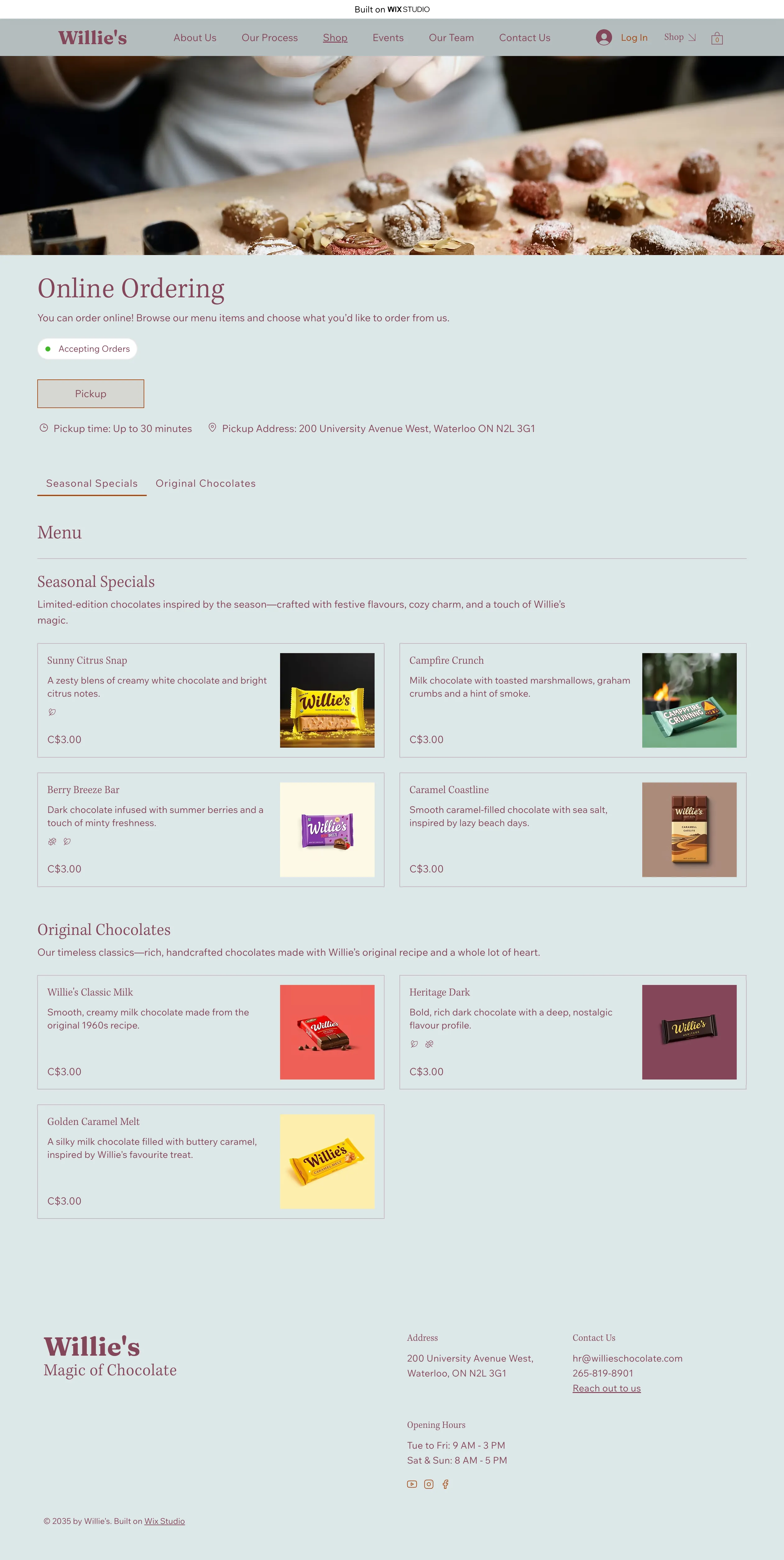
- Narrative product descriptions replace ingredient lists — each flavour is introduced as a story ("A midnight forest walk. Dark cocoa, smoked salt, a ghost of bergamot") to trigger sensory imagination before the purchase decision
- The checkout is renamed "The Golden Ticket" — a small copy decision that reduced cognitive distance between the experience and the transaction
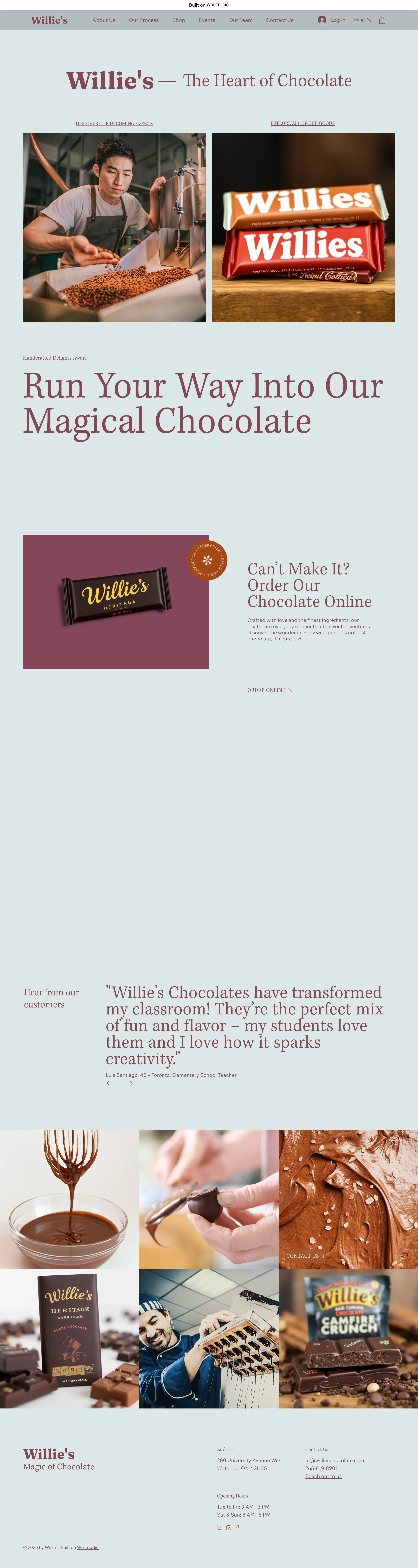
- Consistent CTA placement: "Can't Make It? Order Our Chocolate Online" persists across all pages, bridging physical fantasy and digital commerce
- Micro-interactions reward curiosity: hover reveals on product cards, scroll-triggered reveals on the homepage, confetti animation on add-to-cart
- Product photography sits against dark jewel-tone backgrounds rather than white — keeps the immersive mood alive even in a shop context
A brand that "felt like it could actually exist"
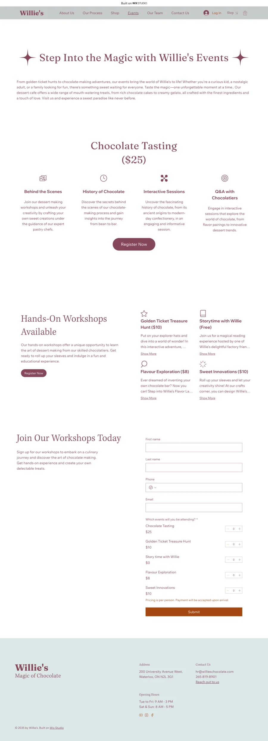
The Willie's Chocolates experience is live on the web. The Wix prototype demonstrates a full brand ecosystem — homepage, product pages, events section, and an end-to-end ordering flow — with a consistent visual and tonal language across every touchpoint.
Key outcomes from the design process:
- Three distinct visual directions explored and evaluated before committing to the final system, each rejected for specific, articulated reasons
- Checkout abandonment risk reduced by renaming the cart and checkout flow to maintain immersive framing throughout the transaction
- Product descriptions written as narrative copy — a deliberate UX decision to activate sensory engagement before the purchase decision
- The final site earned positive feedback from peers and instructors for its emotional coherence: the brand "felt like it could actually exist"
Brand-led UX is rigorous in a different direction
Brand-led UX is as rigorous as problem-led UX — just in a different direction. Instead of starting with pain points, you start with a feeling and work backward to the features that create it. The constraint is emotional consistency rather than task efficiency, which is deceptively hard to maintain across a full product.
The most important lesson: every design decision is a brand decision. The name of the checkout button, the amount of whitespace around a product image, the exact wording of an error state — all of it either reinforces the story or breaks it. Getting that right required treating copy, motion, and layout as inseparable parts of the same system.